Tuesday, 12 April 2011
Monday, 13 December 2010
AS MEDIA STUDIES
FOUNDATION PORTFOLIO
RESEARCH & PLANNING
CENTRE NO: 11049
ST FRANCIS XAVIER COLLEGE
FOUNDATION PORTFOLIO
RESEARCH & PLANNING
CENTRE NO: 11049
ST FRANCIS XAVIER COLLEGE
—My name is George Okello Baiyelo
—My candidate number is 30022455
Research and Planning
—I considered the fact that my target audience would be mostly of black heritage so I decided to base the theme of my preliminary task on Black history month, seeming as it was October.
—In result of this I decided to use inspirational based language, hence ‘never say never’, in hope of reminding the young black people of society today how far we have come and how hard our for fathers had to suffer to get us to this point, so we shouldn’t waste this opportunity. This is also the case in the magazine title; encore – applaud ourselves for how far we’ve come.
—I have also included a feature about how our EMA could be gone by Christmas, the article at the bottom, from saveEMA.co.uk I discovered whilst researching.
—In addition to this I also decided to make the magazine free, as it would be better tended to the audience and in coherence with the current financial climate.
—Through this exercise I also learnt:

—How to crop out the background in Photoshop
—And how to add special fonts to an image on Photoshop.

Preliminary exercise


Research and planning
If I was to do the preliminary exercise again I would definitely invest a greater use of fonts as I felt this was the main flaw in everybody's piece. In the main task I will definitely be going outside to use an altogether more collective range of fonts than what the school provides as I feel it would greatly enhance the appearance of the magazine.
Another common flaw I acknowledged was the quality of the images used. For the main task I will definitely be investing in a better image as I felt the one I used lacked the front page magazine potential.
I would also include more designs on the contents page.
To summarise it is therefore important that I improve my awareness of Photoshop and in design so that my editing can improve to a satisfactory standard, and hopefully with the use of better images and fonts I can produce a shelf quality magazine.
 Further work
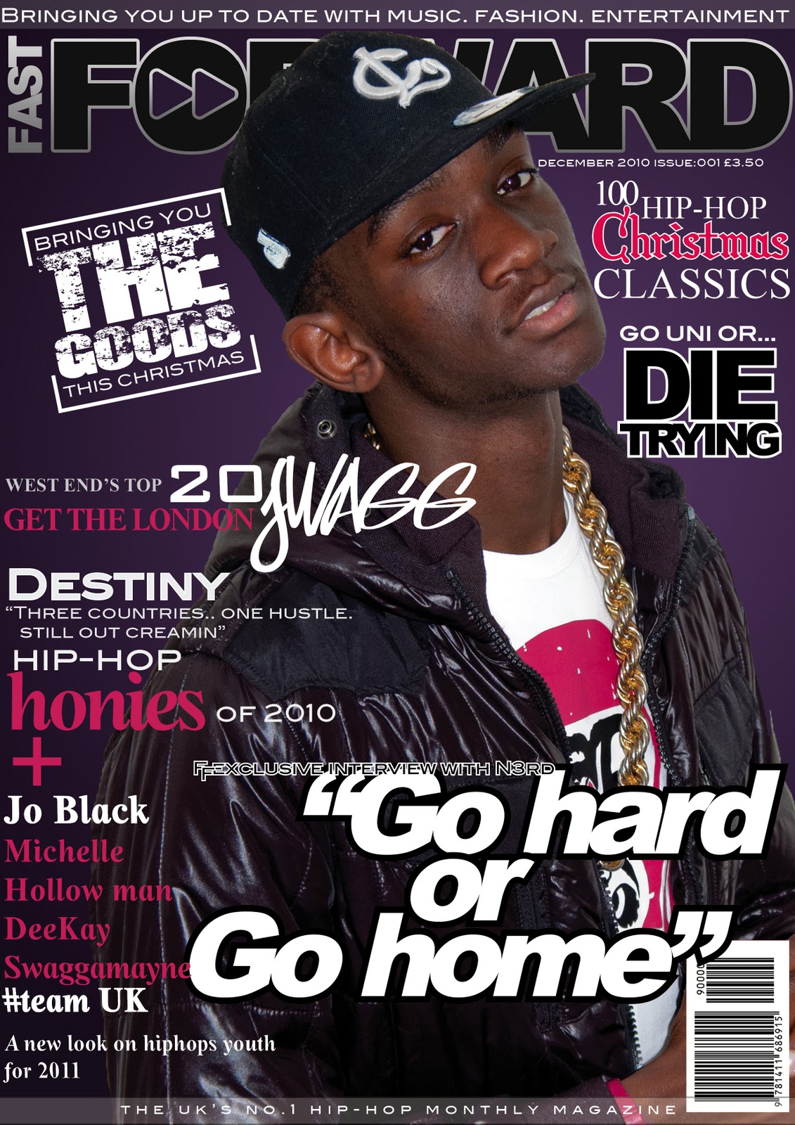
Here I and Andre Gordon, (co-founder of N3rd) have done our own version of the preliminary task. Using both fireworks and Photoshop, we successfully produced a magazine able enough to compete with other top brands on the market shelf. I came up with the ideas, and Andre helped me edit the mag, and it is too this level I would like to complete my main task.
The music genre of my magazine is: Hip-hop
My chosen title is Fast-Forward because it’s a component of music mixing and luckily no-one has used it. It’s short, simple and easy to remember which is a good aspect to consider whilst making a magazine.


What I learned

 Cover Designs: All magazines use bold headings (aside from the Michael Jackson one) to clearly title the magazine. I liked the Rap-Up magazine because of its use of colours, the font and the positioning of Keri, Solange and Teyana. I also liked the way the magazine has used full body shots instead of medium close up pictures and along with the colour selection and the poses of the models, conveys a real sense of fun. The XXL magazine in contrast is quite dark in comparison and its simplicity attracted me. This can be linked to the Hip-hop weekly magazine which uses a picture of Michael Jackson and less text to convey a real sense of class to pay its tribute to the tragic death of the fallen king. Even more is the way a photograph of rapper Jeezy and his reflection against a building is used as magazine cover in The Source. Both are different to your traditional layout of a magazine in contrast to the first two, but all 4 present a front cover that is different from each other and unique, especially the last one.
Cover lines: All the magazines put an emphasis on famous people. The people mentioned are all of black influences so that’s another factor to consider on whom exactly will be buying my magazine. The first magazine also writes ‘Stop and Stare introducing…’ conveying a bubbling confidence, in contrast to the second which conveys a more sinister personality all together ‘King of the south did not exist before me, the term cannot pass along unless I choose to pass it along’. Both come across arrogant; and that is something to consider whilst writing the cover lines of my magazine. The MJ mag simply dedicates the front page to a tribute to the king and The source’s main story says’ Hero to the Hood’, again highlighting its sense of identity and I also like the way ‘the’ has been written at a different angle in the title. I may use it.
— My target audience will be a youthful market ranging from teenage to middle aged years.
— It will be released once a month throughout a yearly period
— The price will range from £3/3.50 which isn't too expensive considering it’s a monthly magazine
— The publisher will be myself InterMedia and N3rd; my close friends business, and the magazine will explain what N3rd are all about.
— Unique Selling Point will be the colour, the information, the flare, the passion and the exuberant youth of the magazine which will make the reader purchase next months edition.
— My magazine develops forms and conventions of real media products by directly targeting young people and challenging the stereotype the media has presented for those who listen to music such as hip-hop.
— My magazine will represent this youthful market through the images and cover lines provided.
— As well as the n3rd website http://www.n3rdonline.co.uk/Index.html the magazine will be published in newsagents, big-chain supermarkets such as Sainsbury's and Tesco, and on facebook. The publishers will be InterMedia partners- the same company that published the hip-hop magazine Vibe.
— The magazine will attract and address the audience through its range of images and news in relation to the events occurring today. The tile Fast-Forward will stand for fast-forwarding real media conventions about black people today and directly challenge the stereo-type people have of people who listen to hip-hop. The main story will therefore be based on N3RD and how they are trying to work with young people to produce videos that people would’ve thought only people of a certain stereo-types could produce. It’s all in the process.
—
— From completing the magazine I have learnt about Adobe in design and the ideas that go into creating a magazine. And this is just the front page!
 Original plan for magazine + photo


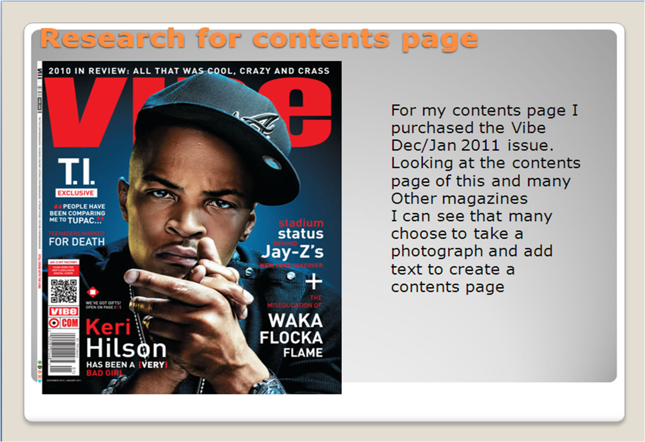
 For my contents page I purchased the Vibe Dec/Jan 2011 issue.
Looking at the contents page of this and many
Other magazines
I can see that many choose to take a photograph and add text to create a contents page.
However I plan to challenge this concept by using the design of the Questions section as I feel this looks more suitable for the purpose as it is more informative and easier to read,.
The theme of the contents page will again be on young people and they will be represented by the images documented in the contents page. This can be linked back to Laura Mulveys theory about representation; if you are not represented then you feel left out.


Here is the contents page i created. I have used the vibe questions page as a base to form my contents page as I felt it was more informative and easier to read. From making this I have learnt about the importance of a good quality image and how to manipulate it further using Photoshop. This is evident in the progress made from my preliminary task, where I used on the text and rectangle tool. Here I have used the page much more creatively, using a colour theme and including multiple images, fonts and headlines. This is not only evident in the contents page but from the epic improvements made to the front covers.

The contents page links back to the main cover as the images on the contents page all relate to what was mentioned on the front page. The main story could perhaps be more obvious but that aside, everything else is clear and concise.
My contents page makes the reader want to read on through its use of images and clear and easy instructions about what is where and what page to turn to. However the information does appear to look quite compressed, (in particular the section on the right listing all the editors) and there is allot of un used space to the top right of the page so this is something that will have to be thought over.
All the images have words relating to it, be it the actual person or something relating to the topic (the uni crisis picture for example)
The dominant stories all have pictures to represent them and the layout has been inspired by the question page of the vibe magazine I purchased


I have looked at the vibe contents and the Q magazine as well as two of my class mates who I found inspiring.


Here are the pictures I took for the contents and double page spread using a Canon eos 450d


 And here is the contetns I created.
I am designing my double page spread to again challenge the stereotype society has put out for hip-hop listeners by basing the main article on N3rd and how we are inspiring young people to do what they want. The article will have images of me, Andre and some other people, all young, which will represent the young people of society we are reaching out at. And I am going to address the young audience directly through my interview with Andre and the subtitles used on the page. The whole interview will be based around inspiration and belief that young people can get where they want today and, hopefully, be inspired, partly, by what they read on this double page spread.
I also want the spread to as professional as possible so I am going to link up with a photographer to ensure I over come the hurdles I met in the preliminary and front cover exercise. Hopefully then the message can be hit home hard through the words and the good quality images on the page.


I have challenged this by using pictures such as Andres one (pictured left) which portray young black people in a different image.
My magazine uses the basic structure of a double page spread consisting of text neatly presented round a series of images. Looking at various double page spreads on the internet and in the vibe magazine I purchased I again noticed the use of single images structured around columns of text. This method works, but again it would appear certain articles have placed the emphasis on the picture instead of the content. This was the problem especially in male magazines such as sport articles and male weekly’s such as Nuts and Zoo where the frequent use of images filling up the space seemed to conform to the stereotype that men do not like reading. Observing these features I noted how other magazines such as Vinyfair placed an emphasis on the quality of text and looking back at music magazines such as vibe I also observed how their double page spreads placed an emphasis on both image quality and the text. So I decided to use elements of both and used various images across my page as well as a good variety of text, one page focusing on the quality of the picture and the other focusing on the text.
I have used the pictures to fill up all the space available on the page and it worked well, revealing a double page spread that both reveals a story and appears physically attractive, conforming to the normal standard of a double page spread.
My double page spread places an emphasis on youth, conforming to the main message of the magazine ‘bringing forward real representations of the youth of today’. The images presented are all of the youth of Britain, and this conforms with hip-hop as it is the music we listen to, and what society stereotypes us to listen to. The difference is that Fast Forward is trying to change the opinion society has on those who listen to hip-hop and as we are stereo typified, especially young people, to be listening to violence-promoting music and to not have much of a future ourselves, an alarming rate of young people being killed or sent to prison in today’s age. My magazine tries to tackle this problem instead of using it as a base to criticise the youth of today, something which the media always does. The pool of young black people living in this country is especially targeted and I believe it is wrong to brand a whole generation as low lives who listen to ‘a bunch of illiterate ghetto youths’. I instead try to bring forward real hip-hop, real people, real representations of the youth of today and show to society how not all of us, in fact a small percentage of us conform to the stereotype society has expected of us. The magazine does not just address young people but the whole of society, and helps promote a positive image of young people.
In this case the double page spread presents a story about my good friend Andre Gordon, who I feel best personifies what my magazine represents. His story is about the inspiration to show young people what you can achieve with the little that we have. Andre makes videos using a camera and make shift lighting at best and uses his natural intuition to edit and enhance the footage to produce today. It addresses the problems existent within society and tries to convey a good image which the world can translate as a positive representation for the youth of Britain. The wider audience can see what people like Andre are trying to achieve for young people and hopefully they leave with a changed impression of young people today, moving forward to help aid the younger generations, rather than persecute them like the media have done.I have addressed the misconception of young people and used hip-hop to try and get across my message. The pictures on the page all help to visually stimulate the reader. The photo’s all represent young people and what they are trying to achieve today. The photograph of Samuel *(in red) in particular suggests ‘hip-hop’ because e of the clothes he is dressed in. The large image of Andre also places an emphasis on the quality of the photograph and this adds a professional gloss to the contents page. All the pictures used are of a high standard but it is the one of Andre which stands out the most because of the sophistication conveyed through the photography. The black and white helps portray its beauty and helps the message of this picture stand out; the individuals who work hard are the ones who are going to change society. The first page especially conveys a serious attitude, something which society needs to adopt to address the problems surrounding young people today. The tone of the picture is black and white and this also suggests to the reader that the problem is clear and the time to act is now. Future generations are being brought up under the weight of oppression and the increasingly bloated weight of over-taxation, debt, schisms in society and a period infested with injustice and warfare. What this has to do with hip-hop is that among these people are the millions of children who listen to this genre of music and who are being affected by the mishaps of society. What’s more is that they are being persecuted unjustly and that is the main motivation behind the magazine and the double page spread. To spread some light over this genre of music and over the young people society has seemingly been eager to cats out. Hopefully through this article people can realise that it is not so black and white after all and there is light and hope for the young people of today. It is important that these young people get noticed, and Fast Forward aims to bring forward the good work of people like Andre and repair the broken bond society has constructed with its children, as well as rectify the broken image of hip-hop and restore it to the colourful black music of which it is.
I have addressed the young people through the visual representation and the text has addressed those blinded by these misinterpretations and those who impose them and the article brings forward the good message about young people and hip across the world to the world.
The double page spread is physically attractive and informative and addresses audience through the topics raised and confronts society’s hostility towards hip-hop and young people. It also conveys a positive message about the young people of today and personifies what the Fast Forward magazines is all about, bringing forward the positive representations of young people and the shining talent this country hones, especially in music and in genres such as hip-hop, and aims to build back the bonds tyranny has maliciously destroyed with the world.
From the construction of my magazine I have learnt a number of key skills you need to know in the media world. The process contributed to my understanding of adobe Photoshop as well as introducing me into Adobe InDesign. In Design especially made me understand how to construct a double page spread physically, as well as consider other important aspects such as the picture, the colour scheme and the fonts.
The progression of my pictures especially emphasises the various stages I completed to achieving the quality of photos in the double page spread. I learnt about the importance of lighting, positioning and camera lens which is needed to take clear, concise pictures which can fill a page without appearing pixillated. I recognised the need for this in my preliminary exercise and I contacted a friend who aspires to be a photographer. We talked about the scenario, and together with his Canon Eos 450d went out and took a couple photos at Catford running track. The lens allowed for the pictures to be crystal clear and together we edited the photos on Photoshop, adjusting the contrast to achieve a polished effect. The whole process took organisation but it is through this that I learnt about the process of photo taking and editing.
Photoshop was something I was already familiar with from my old GCSE art project, but this AS Media course has allowed me to fully come to terms with how to edit and airbrush images. Though I am not at a level where I can become a professional editor I feel it was a good experience and something that can benefit me in this ever-digitalizing world we live in.

I feel the experience has contributed greatly to my understanding of the production of magazines and made me appreciate the work that goes into making a magazine (that could consist of well over 100 pages!). The journey I have made can be epitomised through my close friend Andre Gordon. He set out to prove that young people can produce top quality editing without the financial deficit or the need for expensive equipment. My magazine takes the basic forms of a hip-hop magazine and reproduces a top quality music magazine double page that could compete on the shelf with any of the big names. It was essential that double page spread was clear and concise to read. The process taught me how to construct a double page spread and this underlined the importance of: * A digital camera complete with a lens * Adobe Photoshop for image editing * Adobe In Design for the laying out of the magazine
The process also revealed to me how it is not that expensive to construct a magazine and how the big names make their profit. This also contributed to my understanding of the transition from hard back to soft media products. The change is well and truly started and those who fail to convert will be left in the darkness; which stresses the importance to educate the young people today about the importance of technology in the present day.
From the construction of the double page spread I have learnt allot about the construction and structuring of a double page spread, as well as the importance of Adobe InDesign.
The constructing of the double page spread revealed to me how you could use In Design to its best effect and the introduction of this allowed me to structure a document fully to the design of a magazine. The programme allows you to structure the text across the page more easily than in Photoshop, let alone Microsoft Word and this is what gifted my contents page and front page especially an edge, allowing you to structure image above text with significant ease. This was presentation and evaluation blog


work


work
Subscribe to:
Comments (Atom)